Behind the print: "Passing Storm (Waterloo Bridge)"
- lucy w
- Oct 13, 2022
- 4 min read
Updated: Oct 14, 2022
Jennie Ing's linocuts of London explore her love of architecture, the bustle of the city and contrasting colours. She explains how she captured this summer storm on the skyline and why this print has a special meaning for her.

What made you decide to make this print? Was it something that just caught your eye, or did you seek it out? What did you like about this view?
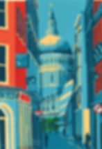
I wanted to make a linocut landscape view of the London skyline from the river and had gone into London one day to get some ideas. I headed to Hungerford Bridge as the views from there can’t be beaten (in my mind). As I got there, the heavens opened with a heavy summer downpour, and everyone rushed for shelter under the bridge and in the Tube station. After the rain stopped, I started to cross the footbridge to take some photos and I was struck by the dramatic sky as the clouds rolled away. I didn’t decide until later that I was going to recreate the sky like this in my print – I was, at the time, more interested in what I could see in the lovely London skyline and how I could include it all.


Above: A slideshow of photos from the making process (not all stages shown)
Did you do a lot of sketches and take photos? It is such a panorama, it must have been really difficult to decide how to reduce the amount of detail in the scene to work as a linocut.
I took quite a lot of photos and made sketches from them. I wanted to include many of my favourite buildings, the Barbican estate towers on the left, St Paul's more central and the Shard to the right with the City, Oxo and various other buildings too. And some cranes – there’s always some building work going on somewhere. Once I had a focus on these, I felt other buildings could just be a suggestion of what they are and would make some sort of sense in the finished print without adding too much detail. I find it impossible to pick everything out as it is, let alone depict it in a linocut of this size.

There’s so much movement in the water. How did you handle that?
I'm often asked this and it’s strange as I can’t really make myself do it any other way, no matter how much I look at other linocut artists’ work. I basically chip little bits of the lino away with the smaller rounded tools as I work through each layer. I work out the areas that are going to be darker or lighter, so I cut more or less there. It gives the impression of being a bit choppy, which it quite often is, and with the light catching it here and there, or going into shadow, say, under a bridge.

I love the subtle variation in the greys and the pops of red and green. Was that something you had in mind as soon as you saw this scene?
That came later. When I started drawing it out, I was thinking of a pleasant blue sky kind of day, maybe a few fluffy, white clouds. At the drawing stage, I’m thinking of the colours I'm going to use and how I’m going to build up the layers. Then I had a sudden light bulb moment and decided it wasn’t going to be summer blue skies but that sudden downpour scene on that summer’s day. I figured I'd use mostly bluey-grey shades, but there needed to be pops of colour and only across Waterloo Bridge to draw the eye to the skyline, which was the real focus of the print. There’s always a bus to be seen in London and Waterloo Bridge is no exception, so an obvious choice to me and three is a nice number, and I wanted a contrast, so some green trees. I put these in ever so carefully right at the beginning by masking off the rest of the print as I printed these colours. Once they were done, I worked though the greys.
It’s a reduction linocut with a total of seven or eight layers. With a reduction print, all the colours come from the same piece of lino with successive cutting away of the lino before printing the next colour (or shade) of what has been done before. There’s no going back and all the prints have to be completed at the same time.

This print has a special meaning for you, doesn’t it?
Though I took the photos in the summer of 2019, it wasn’t until around six months later that I started work on the print. There was talk of a new virus and by the time I’d printed the first layer or two it had reached our shores. We were obviously going to have a lockdown at some point. We, none of us, knew how it would change our daily lives. We were living in quite anxious states. Working on this print gave me a positive and wonderful focus away from all the doom and gloom in the news. I’m lucky that I have my own press, as it was my saviour through that time and I really enjoyed being able to concentrate without the obligations the outside world usually expects.
What are you working on at the moment?
I’m working on a couple of things at the moment – a bit more local to me in south west London. I don’t like to say too much before they’re finished, but they will hopefully be going into gallery shows I’m doing in November in Richmond and Hampton Court. Fingers crossed they work out well and are finished in time. Once they’re done, I’d like to do some more London scenes, probably from the river again.
Jennie's featured artist show runs at Greenwich Printmakers until October 30 and her fabulous reduction linocuts are available from our online shop and our gallery in Greenwich Market all year round. For more information, see her artist's page and her website.