Behind the print: "From the North"
- lucy w
- Jul 17, 2022
- 5 min read
Julian Davies explores pattern, colour and imagined landscapes in his featured artist show at Greenwich Printmakers. He talks about the inspiration behind his work, his methods and capturing a message in his “From the North” linocut print.

You’re showcasing some of your ‘imagined landscapes’ in your featured artist exhibition. Where do those ideas come from? Are they inspired by real places, or reading something about a certain idea or theme, or do they develop spontaneously from the patterns you draw?
I wanted to approach landscape from a different angle, rather than just as a representative image of a certain place. I’m combining my interest in abstraction, colour, pattern and form to produce what I refer to as ‘imagined landscapes’. The work investigates how rural and urban areas can be, and often are, edited into one image to produce a landscape based more on fantasy, imagination and memory, than reality, becoming a unique cross section personal to me. Certain places and times can take on special meaning or folkloric significance, and I strive to represent this in the prints.
Initially there’s a more spontaneous element to the work, with ideas drawn straight on to the lino – abstracted rock formations and hills, say – rather than sketches made directly from the source. These shapes may then suggest specific places, or memories of places – say a solitary tree on a hill in the Cotswolds, or some windswept Scottish hillside – but without being anywhere specific. Something akin to a fleeting glimpse seen from the train. What I’d describe as Everywhere-Somewhere-Nowhere places, if that makes sense.


Above: The four stages of creating "From the North", adding more elements with each layer
Are they reduction or multi-plate linocut prints?
There’s a mixture of linocut methods on display. The colour images are either reduction or multi-block (usually involving one reduction block), but there are also some straightforward black and white, single block images.

Your imagined landscapes are really atmospheric and often capture a feeling of the weather or a particular mood. Some of them are humorous, while others are more poignant.
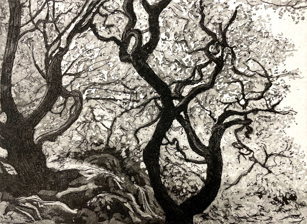
There’s an environmental message in a number of the images, which is something I feel passionate about. “From the North”, for example, is about the climate crisis, with the polar landscape, melting ice and encroaching urbanisation – the threat coming from the north of melting ice caps leading to rising water levels.
There are a number of images where I’ve tried to suggest a sense of depth by opening up the traditional rectangular picture plane – to let the paper come through the image and do some of the heavy lifting. With an image like “The Space Between Us”, I’ve tried to capture an atmosphere by what’s in the image, as well as by what isn’t there. I like the ambiguity of the title too – is that space between us a good or bad thing?

The mood of the work is always going to be influenced by how I’m feeling at the time, so sometimes the images will be quirky, sometimes poignant. The mood of the piece will also be influenced as the image develops – something like Spooky Action with its Scooby Doo haunted house is always going to land in the humorous camp. I think that the ‘music’ I listen to has inevitably crept into the work – whether that’s the gothic-metal sweep of Paradise Lost or Opeth, or the more poignant tones of Anathema.

Patterns are really important in your work and you have developed a visual language that flows through your paintings and prints. How did that come about?
I really love pattern, so it seemed natural to try and incorporate it into the work somehow, as a visual tool to move the eye through the image. I’m always on the look out for it – whether that’s in the landscape, in rock formations or the bark on trees, or in urban settings like walls or roof tiles. You can get some odd looks off people when you’re taking photos of walls or the floor, I can tell you.
Japanese Zen gardens have been a major influence, as has Japanese culture generally. With the Zen gardens, they’re like imagined landscapes in themselves, with the moss, shrubs, trees, rocks jutting out like mountains, set in the raked gravel ‘sea’. There’s a wonderful sense of tranquillity and solitude to them, and each one unique. While they’re clearly man-made, you get a fantastic sense of being at one with the natural world. There are also some fantastic patterns in the construction of Japanese temples, and kimono patterns can have a wonderful abstract quality to them.

Your use of colour is fantastic – how do you decide which colours to use? Do you do lots of tests to see what will work well together? Or are your paintings part of the testing process, because of the freedom to experiment more easily with colour?
The colour can be dictated by how the block looks once I’ve cut the first stage, or by something I’ve seen on the way to the print studio, or I may decide to go for the opposite colour palette to those I’ve recently used. The following colours will be decided on how that first colour looks and what I think will work with it or against it. Nothing is pre-planned, it's all a reaction to how the work is progressing. It provides a slight element of chance into the work, which is otherwise quite rigidly controlled. My paintings do feed into the print process, and vice versa, and it’s certainly easier to cover any mistakes made while painting.
Colour is hugely important to me in the work, and the artists I admire tend to use bold colours – Matisse, Heron, Kandinsky, McLean – so their influence has undoubtedly crept in. I want the work to be bold and fun, so the choice of colour is a part of the process and how it interacts with the forms. I do occasionally use a more subtle palette, but it's never too long before I return to the bolder colours. Print can be a monochromatic medium, which can be striking, but even when I specifically cut a block to produce a black and white image, I'm always thinking about how I can introduce some colour to it.
How have you found printing in this hot weather?
Cutting the blocks at home can be a little unpleasant in the hot weather. Thankfully the relief print area at Thames-side Print Studio, where I print, has many openable windows, so is well ventilated. It also helps to get up and over there in the morning before the worst of the heat. Having everything needed within reach and an economy of movement certainly helps to keep the comfort levels bearable. On the plus side, the heat makes the ink less viscous, so that can help with inking up.

What are you working on at the moment?
I’ve been working on some figurative linocut pieces, which is a bit of a departure, but I’m enjoying the challenge of trying something different. There are also a few ideas for some more imagined landscapes starting to take shape.
Julian’s featured artist show runs until August 7 and his bold, colourful prints are available at the gallery and in our online shop all year round. For more information, see his artist’s page and his website.


Comments